
It’s good to figure out that not only you but a significant number of LinkedIn social media users and audiences are interested to know: What font does LinkedIn use for posts, articles, logos, messages, etc.? LinkedIn definitely uses appropriate and standard fonts to improve the experience of its users.
You don’t need to look any further to come up with your answer. That’s why we’ll answer all your questions about LinkedIn fonts. Just stay with us until the end of the article.
The vast majority of popular social media such as Twitter, Facebook, LinkedIn, etc., take advantage of images, various colors, and typography with unique fonts to convey the warmth, humanity, and comprehensiveness of their brand to ensure that their design is accessible and inclusive to all users and clients.
The importance of choosing the best font: What font does LinkedIn use?
It’s worth mentioning that selecting the best and most appropriate font for website design is as important as implementing SEO rules.
Opting for the best font in the website design and the loading speed is one of the most significant and decisive factors that significantly impact the user experience, increase visits, and reduce the bounce rate of your website. As a result, learning from the LinkedIn experience in website and font design can help you develop your business website.
Examples of typography used on LinkedIn

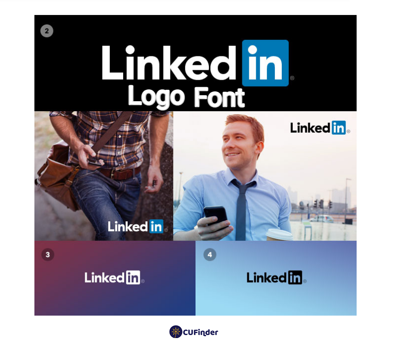
LinkedIn logo font
LinkedIn’s design team uses Myriad Pro-Bold and Myriad Pro-Black fonts for the logo of their platform in such a way that Myriad Pro-Bold is exerted for the “Linked” and Myriad Pro-Black is utilized for the “in”.
It’s interesting to know that, as noted on Fontslogo.com, this font was first published by Adobe Originals in 1992, designed by Robert Slimbach and Carol Twombly for Adobe Systems.
Besides the logo, it can be used for a combination of text and display.
LinkedIn website font
According to Brand LinkedIn, the Source Sans family (such as Source Serif and Source Code) is used as the main fonts on the LinkedIn website for key brand messages in headlines, display, body text or copy text in offline marketing materials, “reader” font in blogs and long texts like articles in different types of Light to Semi-bold.
Once the Source Sans family is unavailable, LinkedIn uses alternative and secondary fonts that can be serviceable for consumer testimonials, user quotes, etc.
These fonts used on the LinkedIn website include Arial, Georgia Italic, and Helvetica, which are displayed by default in the system.
On top of the above fonts, LinkedIn has designed a new custom font called Community, which contains handwriting elements and round letters.

Is it possible to adjust the font size on LinkedIn?
As far as we know, setting the font size in LinkedIn is only available in the LinkedIn mobile app and only in its iOS version.
If you have an iOS mobile device, you can easily adjust the font size used in the LinkedIn application according to the steps below. In such a way that:
- Step 1: Open the Settings page of your mobile phone
- Step 2: Click the General, Accessibility, and then Larger Text buttons in order. Keep in mind that you can toggle the Larger Accessibility Sizes button at this step to enable and disable more options.
- Step 3: Move the text slider to adjust the font size to your liking
- Step 4: Re-open the LinkedIn app on your iOS mobile phone
What Font Is the LinkedIn Symbol Currently?
The new LinkedIn symbol looks a lot like the old one, but they changed the font from Myriad to Avenir Black.
We’re not exactly sure when they made the change, but it was likely in December 2012 or earlier.
What Is the Best Font for LinkedIn Articles?
The best font for LinkedIn articles is one that is clear, professional, and easy to read.
Fonts like Source Sans, Arial, Helvetica, and Times New Roman are popular choices due to their simplicity and readability.
These fonts ensure that your articles are accessible to a wide range of readers and maintain a polished appearance.
Additionally, it’s important to consider the size of the font and spacing between lines to enhance readability further.
Aim for a font size of at least 11 or 12 points and ensure adequate line spacing to avoid cluttered text.
Ultimately, the best font for your LinkedIn articles is one that aligns with your personal style and the professional image you want to convey.
Experiment with different fonts to find the one that best suits your content and engages your audience effectively.
What Font for LinkedIn Banner?
For your LinkedIn banner, it’s best to use a clear and professional font that complements your personal or professional brand.
Fonts like Source Sans, Arial, Helvetica, and Calibri are good choices due to their simplicity and readability.
You want the text on your banner to be easily legible, especially considering that LinkedIn banners are typically viewed on various devices and screen sizes.
Additionally, consider the overall design and message of your banner when selecting a font.
If you’re going for a modern look, you might choose a sleek sans-serif font. Alternatively, if you prefer a more traditional or elegant style, a serif font could be a better fit.
Ultimately, the key is to ensure that the font you choose enhances your banner’s visual appeal and effectively communicates your message to your LinkedIn audience.
How Do I Get Different Fonts on LinkedIn?
LinkedIn does not provide built-in features to change the font style of your posts or profile text.
The platform generally maintains a fixed font style (usually Helvetica Neue) for consistency and readability throughout its interface.
It should be noted that you can italicize or bold your font in LinkedIn articles or change its style for headlines.
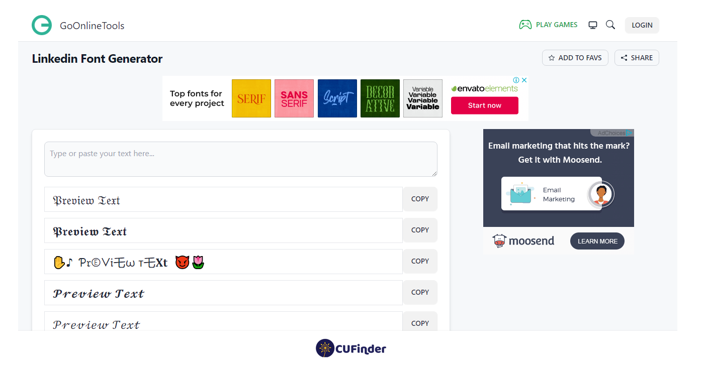
However, to get different fonts on LinkedIn posts, you can use LinkedIn font generator tools like Perfect Font Generator for free.
What Font Does LinkedIn Use for Posts?
LinkedIn primarily used the font “Helvetica Neue” for its posts and various interface elements. However, it’s worth noting that design choices, including fonts, can change over time due to updates or redesigns on the platform.
Currently, LinkedIn’s primary font is Source Sans, which is used in messages, headlines, display text, and posts.
The Best Ways to LinkedIn Community Font Download
Downloading fonts for use in your LinkedIn community can enhance the visual appeal and professionalism of your posts and profile.
The best ways to download fonts for your LinkedIn community involve reputable sources and proper installation methods.
One option is to visit trusted font websites like Google Fonts or Adobe Fonts, where you can browse a wide selection of fonts and download them for free or purchase them for commercial use.
Another approach is to explore font marketplaces such as Font Squirrel, Font Community, Social-Fonts, or MyFonts, which offer a vast array of fonts from various designers and foundries.
Once you’ve found the perfect font for your LinkedIn community, follow the provided instructions to download, install, and use the font in your LinkedIn posts. Utilizing these tools ensures consistency and branding across your content.
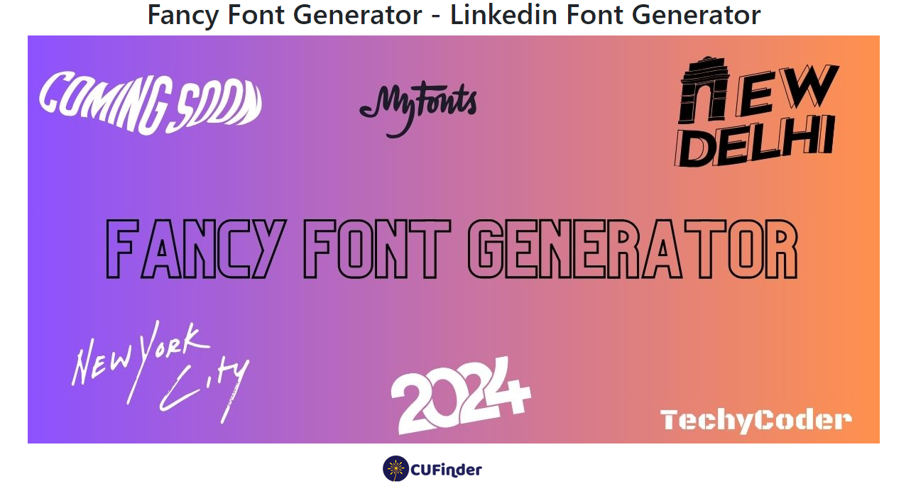
LinkedIn Font Generator
A LinkedIn font generator is a third-party tool designed to alter the appearance of text on LinkedIn profiles or posts by providing different font styles.
These generators typically offer a variety of font options beyond the default font used on the platform.
Users can input their desired text into the generator and choose from the available font styles to create visually unique content for their LinkedIn profiles or posts.
For example, let’s say you want to make your LinkedIn post stand out. You can use FancyFonts or Perfect Font Generator to transform your text into a stylish font, adding a touch of elegance to your message.
These LinkedIn font generator tools can help grab attention and make your content more visually appealing, potentially increasing engagement with your audience.
Related Questions & Answers
What font does linkedin use for resume
LinkedIn does not prescribe a specific font for resumes created on its platform. You have the freedom to select any font that aligns with your personal preferences and enhances the readability of your resume. It is generally recommended to use professional and widely recognized fonts such as Arial, Calibri, or Times New Roman to maintain a clean and polished appearance. Ultimately, the most important aspect is to ensure that your resume is easy to read and presents your qualifications effectively.
What font does linkedin use free
LinkedIn does not provide a specific font for free use. When creating content on LinkedIn, including profiles, posts, or messages, users are typically allowed to choose from a wide range of fonts available on their devices or platforms. These fonts can vary depending on the operating system, software, or browser being used. It is advisable to select a font that is legible and professional-looking to ensure your content is easily readable by others. Some commonly used fonts for professional documents include Arial, Calibri, and Times New Roman. Ultimately, the choice of font is up to the user’s preference and should prioritize clarity and readability.

Conclusion
We return to the first question: What font does LinkedIn use? It’s essential and valuable to know what font famous and strong social media like LinkedIn apply for their website, logo, and other texts to attract potential audiences and customers so that we can also use their design and type of font on our websites.
FAQ
Did LinkedIn change their font?
LinkedIn had indeed made various design updates over the years, including adjustments to their user interface, which can include font changes. Design platforms frequently make updates to improve user experience or refresh their brand. For the most recent and specific updates to LinkedIn’s design or font, you’d have to refer directly to LinkedIn’s official announcements or updates from their design team.
What font is the LinkedIn logo in Word?
The LinkedIn logo doesn’t use a font available in standard word processing software like Microsoft Word. Instead, it’s a custom-designed logo that represents the company’s brand. If you’re trying to replicate or use the LinkedIn logo for legitimate purposes, it’s best to download the official logo assets directly from LinkedIn’s branding guidelines. Using a custom design means that there isn’t a direct font in Word that will match the LinkedIn logo perfectly. Always ensure you have permission to use a company’s logo and follow their branding guidelines.
CUFinder Academic Hub, Ultimately Free!
These comprehensive PDFs are your key to mastering the art of professional networking, personal branding, and strategic content creation on LinkedIn.
Click here to Download these ebooks for free!